
Today I was transferring coins from the Kanthaus donation jar to the cash box for the first time. This turned out to be surprisingly difficult and I took the opportunity to redesign it better. The box looked like this:
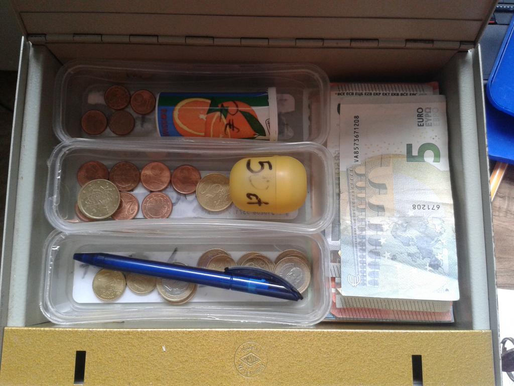
Here the coins are separated into three horizontal trays and two containers. Each tray contains a mixture of coins as indicated by labels written on their bases, from top to bottom: 20c & 1c, 50c & 2c and €1 & 10c. The tube container is marked for €2 and the egg-shaped one for 5c. This design is difficult to use since:
- the tray labels are covered by the coins, making the mixtures look random,
- the order of coins follows no obvious pattern, meaning the place for each coin has to be learned independently,
- the €2 and 5c coins are in closed containers meaning different visual identification are required (i.e. image of coin vs. label,)
- the €2 and 5c containers must be opened, meaning two types of physical action are required to place coins (i.e. dropping into place vs. opening and adding,)
The negative consequences of this design perhaps become clearer when considering the options I was faced with:
- learn the design with its unnecessary complexity, wasting my time and that of future users,
- break the design by throwing the coins in randomly, wasting the time of users now familiar with the current design,
- avoid the design by giving up on the task, leading to a centralization of work on fewer users,
- re-design to be more intuitive for new and current users.
I chose the last option. I added cardboard spacers to the trays to make one section for each type of coin and ordered the sections from most valuable coin to least:
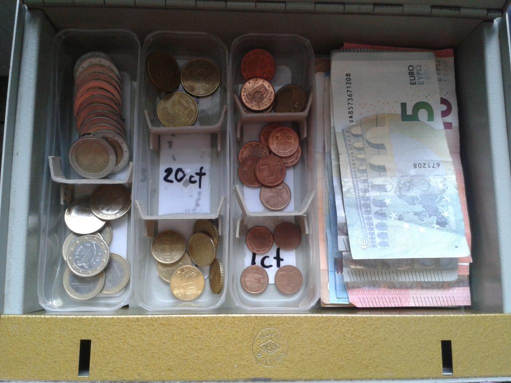
These relatively small changes greatly simplify the process of sorting coins: a user now simply needs to visually match the coin (one identification) and drop them into place (one action). The observant reader will realise this 'new' design closely resembles a standard money tray. Copying or mimicking popular designs is not just flattering, it reduces the amount of education or guess-work users need to understand the intended usage.
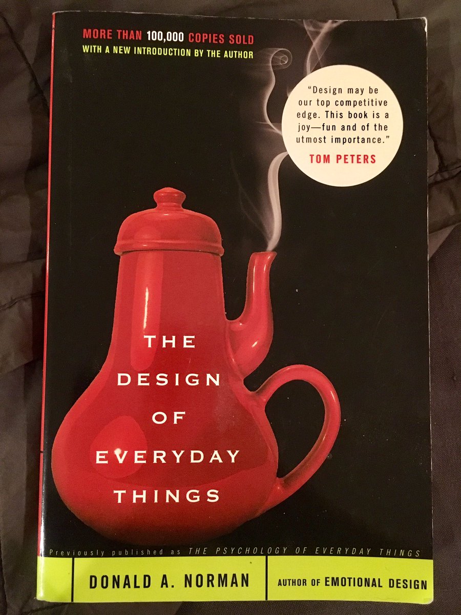
The responsibility for designers to understand potential user needs was impressed upon me by reading Don Norman's book, 'The Design of Everyday Things.' Don explains how fantastically error-prone and cognitively-limited humans are, and that the effort of learning is increased with every new procedure a person has to learn. Designers, being completely familiar with their own designs, can be blinded to the difficulties users will face unless they're careful.
Having empathy for users seems to be critical to good design. Indeed the 'goodness' of a design appears to be dependent on users experience, not the designer's opinion. Through good design we help people use their time and effort more effectively with fewer mistakes; designers should share their users joy. Happy designing and user-testing!
Syndicated from Doug's site